How to use the DIT
This page outlines how to use the Data and Improvement Tool to view your organisation’s data.
Getting started
To get started on the NACEL Data and Improvement Tool, you will need a log in. Please see the Access Guidance for more information.
Once logged in, users will be able to see the results for their organisation’s submission(s), compared to a national sample position and a regional result.
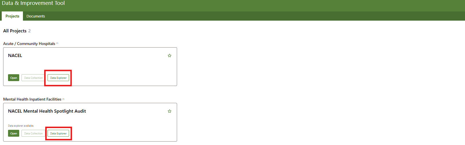
First, the home screen will show the project(s) you currently have access to. Click on the ‘Data Explorer’ button for a project to continue.
How to use the DIT
1. How to locate the charts:
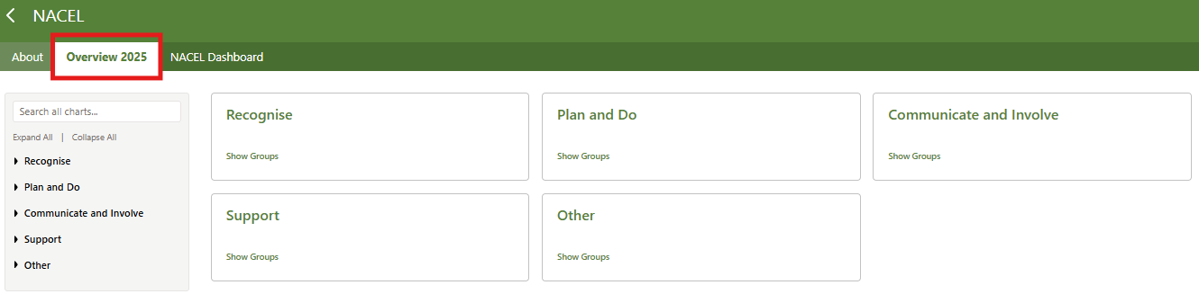
Results here are grouped by how the questions map to the NACEL Driver Diagram. The Driver Diagram is made up of primary and secondary drivers for improving care at the end of life in hospitals across England, Wales and Jersey.
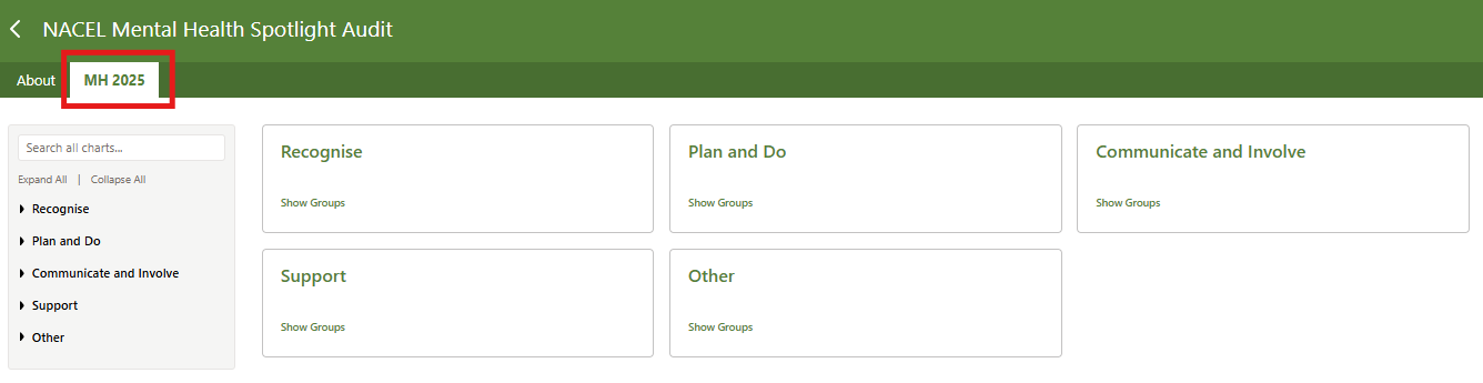
To view a chart, first select a year based on the year of the data you want to view (The Mental Health Spotlight Audit will only have ‘2025’ to choose from). Then select a primary driver using the navigation bar on the left of the page. Alternatively, click ‘show groups’ on the navigation tiles to view the primary drivers. The charts within your chosen driver will then appear underneath the secondary driver they map to. A search function to locate charts based on a key word or audit element is located at the top of the navigation bar.


2. How to read the charts:
The DIT consists of a series of charts, showcasing the findings from NACEL 2024 and onward and NACEL Mental Health Spotlight Audit 2025 and onward for participating providers.
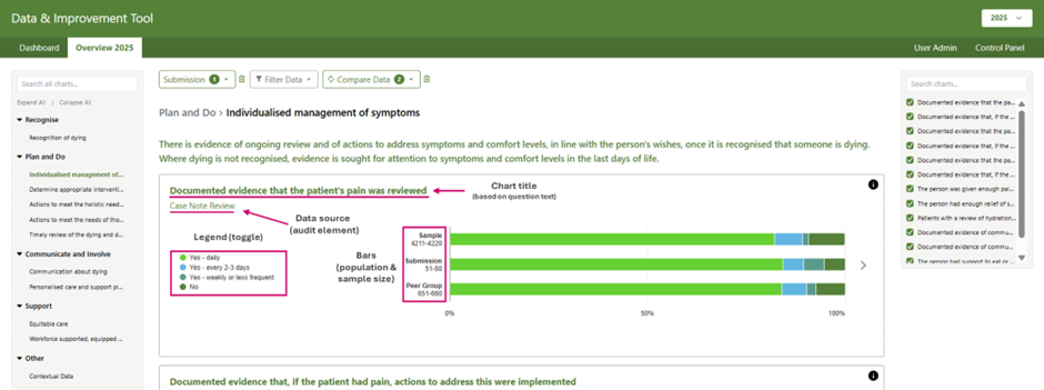
Displayed on each chart is the data source (the audit element the results are from) and the chart title. Each chart will display the audit results in up to three bars: sample, organisation, and peer. There is a button in the top right of each chart to explain what the bars represent:
Sample - The sample bar will show the national mean average across England, Wales and Jersey.
Submission - The submission bar will show the result for the submission selected. You can switch between submissions by using the ‘submission’ drop down function at the top of the page. The results will automatically update in the chart as the submission is changed.
Peer - The peer bar will only appear when a peer is selected from ‘Compare data’ the drop-down menu at the top of the page. This bar will show the mean average result for the peer(s) selected: country/region and/or site type (acute/community).
The number of responses that contribute to the results are shown for the sample, submission and peer in a range of 10 to minimise the risk of reidentification (e.g. 24 responses would be in the ‘21-30’ bracket). You can hover over a bar’s coloured segments to display the answer option and result as a percentage
Tip: The legend shows the answer options and their corresponding colours. Clicking on these answer options toggles them on and off.
Selecting a submission
The NACEL results are available to view for all participating providers. The data is visible to encourage shared learning across healthcare providers and to support quality improvement in care at the end of life.
Use the ‘Submission’ dropdown function to select the submission you want to view. The submissions are grouped by organisation but you can only select one submission at a time.
The selected submission’s data will display on the chart within the ‘Submission’ bar.
Applying a peer group
To give more context to the results, it’s possible to select peers for comparison using the ‘Compare data’ drop down. There are currently two types of peers:
Region: you can view the results for England, Wales, Jersey or a region within England
Site Type: you can choose to limit the results to just acute hospital sites or community hospital sites.
For example, the peer selection below would return the results for acute hospital sites in the North West.
Note: The Mental Health Spotlight Audit will be able to compare data between countries (e.g., England, Wales, or Jersey only).


Applying filters
To give you more insight into your data, filters can be applied to the charts. The filters will apply to all bars, showing the results for the chosen group(s) nationally, for the selected submission, and for any peer(s) selected. Multiple filters can be selected.
To apply a filter, find the category and select the option you want to see.
Once the option is selected, a circle next to the option will go green.
To deselect an option, you can click it again and the circle will become white again.
If you want to clear all filters, press the bin icon.
Note: The Mental Health Spotlight Audit will not be able to apply filters at this time.
Tip: The categories of filters you have applied will move to the top of the drop down list, to allow you to easily update your selection.

Viewing results by date of death
The NACEL DIT automatically displays all data submitted that year to date (2024: complete, 2025: ongoing).
A filter can be applied to view the Case Note Review and Bereavement Survey results by date of death, to better understand if/how care varies at different times of year.
The Staff Reported Measure and Hospital/Site Overview will not display when a quarter is selected – instead, a text box will display which says ‘No Data Returned For The Applied Filters’ or ‘Error While Loading Chart’.
Note: This feature can now be found in the main ‘filter’ drop down. The Mental Health Spotlight Audit will not be able to apply data of death as a filter at this time.
3. How to save/export the data
In the bottom right corner of the chart, there are two buttons that allow you to save/export the data:
Export Data - Clicking this button will download an excel file with the results, as percentages, for the sample, organisation and peer bars
Export as Image – Clicking this button will display a pop-up on the screen to show what the image you are creating will look like. You can then click ‘Download’ to generate an image of the chart.
If filters are applied when you extract to CSV or PNG, they will be applied in the downloaded files too.

Reminder: Please ensure to handle the NACEL data with care. Use it responsibly and maintain confidentiality, as per the Data and Improvement Tool Terms and Conditions.
4. How to gain further insights into the data
There are three tabs in the ‘Explore’ view currently: ‘List Option Bar’, ‘Time Series’ and ‘Data Table’.
List Option Bar (previously called ‘Period - Average’
The default tab in the Explore view is ‘List Option Bar’. Use this view to drill down into the chart findings and to assess your submission’s performance by comparing the results against others.
Each submission’s result is shown on a bar. To help you compare your data, some bars are highlighted:
Pink: Your selected submission
Blue: The other submissions in your selected organisation
Dark green: All submissions within the selected peer group
Use the dropdown above the chart to change the answer option results.
Tip: If you had filters applied when you pressed ‘Explore’, the results will still be filtered.

Time Series
Within the Explore view, the ‘Time series’ tab is available for Case Note Review and Bereavement Survey charts. Use this tab to easily identify any variations in results at different times of the year based on when the person died in hospital. The data is grouped in financial quarters.
2023/24 Q4: January - March (90 days, 91 in a leap year)
2024/25 Q1: April - June (91 days)
2024/25 Q2: July – September (92 days)
2024/25 Q3: October - December (92 days)
2024/25 Q4: January – March (90 days, 91 in a leap year)
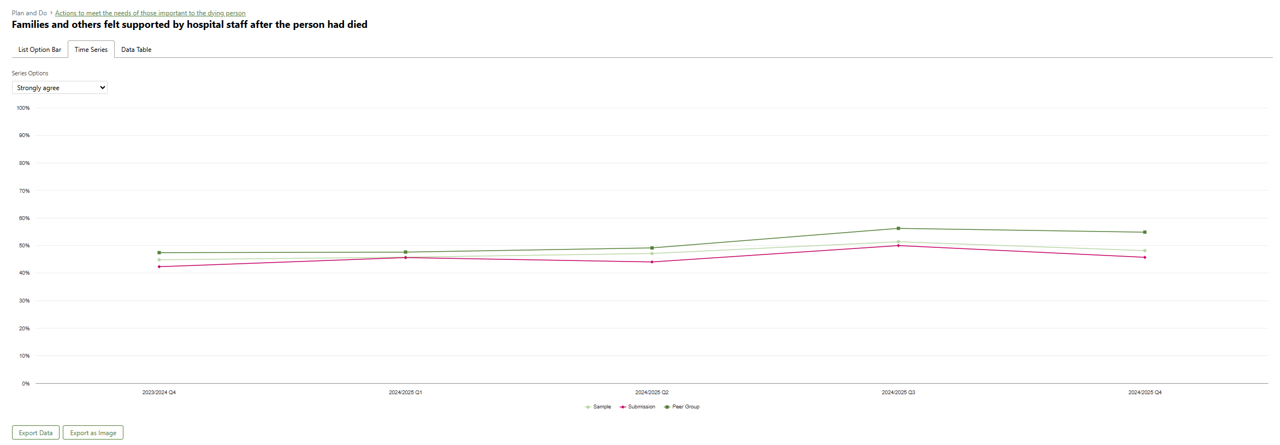
Please note, while all other views display data for the selected calendar year, the Time Series tab shows a data point for all available quarters (not including the current quarter).
Data Table
The Data Table displays a breakdown of results across the sample for the answer option selected. Each row represents a submission. The count range represents the number of responses for the answer option. To help you compare your data, coloured markers will display in the table:
Pink: Your selected submission
Blue: The other submissions in your selected organisation
Dark green: All submissions within the selected peer group